The Most Overlooked Page on Your Website Is Costing You Revenue
Most businesses obsess over their homepage, landing pages, pricing pages, and checkout flows and rightfully so. But there is one page that nearly every business neglects entirely, despite the fact that it appears at the single most powerful moment in the customer relationship: the thank you page.
A thank you page is what a visitor sees immediately after completing a meaningful action submitting a lead form, making a purchase, signing up for a newsletter, downloading a resource, or booking a consultation. At that precise moment, your visitor is at peak engagement. They’ve just said “yes” to you. They trust you. They are more receptive to your messaging than they will be at almost any other point in their journey.
And yet most thank you pages look like this: “Thanks! We’ll be in touch.” That’s it. A missed opportunity of enormous proportions.
A well-designed thank you page doesn’t just confirm an action it deepens the relationship, re-engages the visitor, introduces new offers, and sets up the next conversion. In this guide, you’ll learn exactly how to design a thank you page that transforms a single interaction into sustained revenue and lasting loyalty.
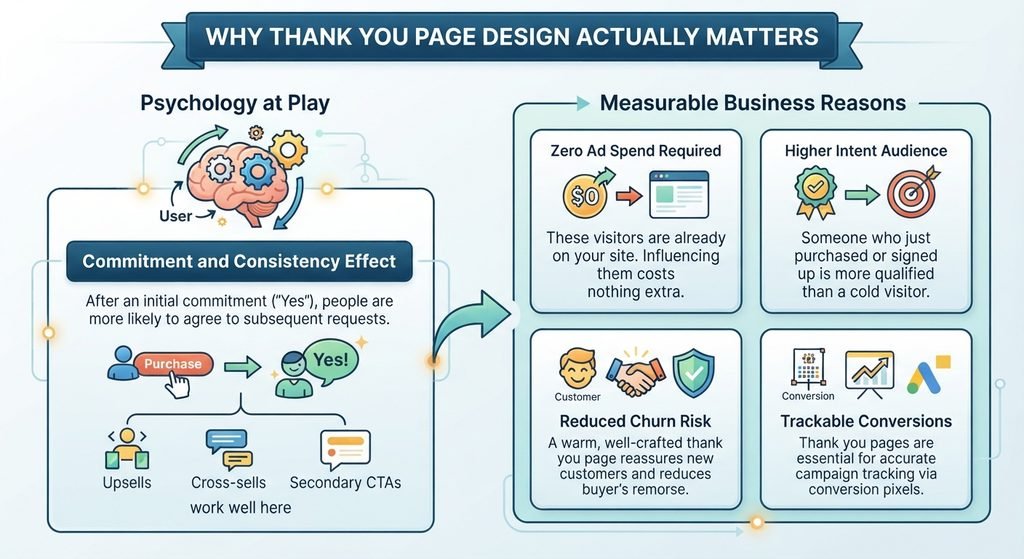
Why Thank You Page Design Actually Matters
Before diving into tactics, it’s worth understanding the psychology at play. When a user completes an action on your website, they experience what’s known as a “commitment and consistency” effect a well-documented behavioral principle where people are more likely to follow through on additional requests after they’ve already made an initial commitment. This is why upsells, cross-sells, and secondary CTAs work so well on thank you pages: the user is already in a “yes” mindset.
Beyond psychology, there are measurable business reasons to care about this page:
- Zero ad spend required: These visitors are already on your site. Influencing them costs nothing extra.
- Higher intent audience: Someone who just purchased or signed up is more qualified than a cold visitor.
- Reduced churn risk: A warm, well-crafted thank you page reassures new customers and reduces buyer’s remorse.
- Trackable conversions: Thank you pages are often used as conversion pixels for ad platforms, making them essential for accurate campaign tracking.
The Core Elements Every Thank You Page Needs
1. A Clear, Warm Confirmation Message
The first thing your thank you page must do is confirm that the action succeeded. This sounds obvious, but it’s frequently done poorly. Avoid cold, robotic language like “Your submission has been received.” Instead, write something that feels human and genuine. Acknowledge what they did, express real appreciation, and tell them exactly what happens next.
Example: “You’re in! Your free guide is on its way to your inbox right now. Keep an eye out it usually arrives within two minutes. While you wait, here’s something you might love…”
This kind of message reduces anxiety, builds warmth, and bridges the gap to your next piece of content seamlessly.
2. Set Clear Expectations
One of the most trust-building things you can do on a thank you page is tell the user exactly what happens next. This is especially important for service businesses and lead generation scenarios where there’s a time gap between the action and the next touchpoint.
- Will you email them? Say when.
- Will someone call them? Give a timeframe.
- Is their order being processed? Show estimated delivery.
- Is their account being created? Link to the dashboard.
Clarity eliminates uncertainty. Uncertainty creates anxiety. Anxiety leads to refund requests and churn.
3. A Strategic Secondary Call-to-Action
This is where most businesses leave money on the table. After confirming the action, your thank you page should present one relevant next step not five, just one. The goal is to guide the visitor further down their journey without overwhelming them.
Depending on your business model, strong secondary CTAs include:
- For lead generation: “Book a free strategy call now” or “Download our bonus resource”
- For e-commerce: “Customers who bought this also love…” or “Unlock 10% off your next order”
- For SaaS: “Set up your profile now” or “Watch your onboarding video”
- For content: “Read our most popular guide” or “Join our community on Facebook”
The key is relevance. The secondary CTA must feel like a natural next step, not a random promotional insert. Just as your CTA optimization strategy matters across the rest of your site, it is equally critical on your thank you page arguably more so, given the audience’s heightened receptivity.
4. Social Proof to Reinforce the Decision
Buyer’s remorse is real, and it can strike within minutes of a purchase or sign-up. A thank you page is a powerful place to counteract doubt by displaying social proof that validates the user’s decision.
Consider including:
- A short, compelling testimonial from a customer who achieved a great outcome
- A trust badge or certification relevant to your industry
- A notable statistic (“Join 14,000+ businesses that trust us”)
- Logos of recognizable clients or media features
This reassurance keeps new customers confident in their choice and dramatically reduces the likelihood of cancellations or refund requests. If you want to understand more about the mechanics of this, our guide on how to use social proof on your website to build trust and drive conversions goes deep into the subject.
5. Referral and Sharing Opportunities
The moment right after a conversion is the ideal moment to ask for a referral or share. At this point, the user’s enthusiasm is at its highest. A simple, low-friction sharing prompt can turn one customer into several.
Options include:
- Social sharing buttons with pre-filled copy (“I just signed up for X you should check it out!”)
- A referral program CTA (“Give a friend 20% off and earn $10 for yourself”)
- An invite link for SaaS products (“Invite your team and unlock premium features”)
Keep these lightweight and optional they should feel like a friendly bonus, not an obligation.

Design Principles for an Effective Thank You Page
Keep It Visually Clean and Focused
A thank you page should feel calm and uncluttered. The visitor has just made a decision they don’t need to be assaulted with information. Use generous white space, a simple layout, and a clear visual hierarchy that guides the eye from the confirmation message to the secondary CTA without distraction.
Remove your primary navigation menu if possible, or at minimum reduce it. You want the visitor’s attention on the thank you page content itself, not on navigating away from it. Understanding how white space in web design boosts clarity and conversions will help you strike the right balance on a page like this.
Match Your Brand Voice and Visual Identity
Your thank you page should feel like a continuation of your brand experience not a generic system page tacked on at the end. Use the same fonts, colors, imagery style, and tone of voice that appear elsewhere on your site. A jarring visual shift at this critical moment can undermine trust.
Make It Mobile-Optimized
With mobile traffic now dominating in most industries, your thank you page must render flawlessly on small screens. Test it across multiple device sizes. Ensure buttons are tappable, text is readable without zooming, and load times are fast. A slow or broken thank you page immediately after a purchase is a terrible first post-conversion impression.
Use Personalization Where Possible
If your platform allows it, pull in the user’s name, the specific product they purchased, or the form they submitted. Even a simple “Thanks, Sarah! Your download is ready” feels significantly warmer than a generic confirmation. Personalization signals that your business pays attention a subtle but powerful trust signal.
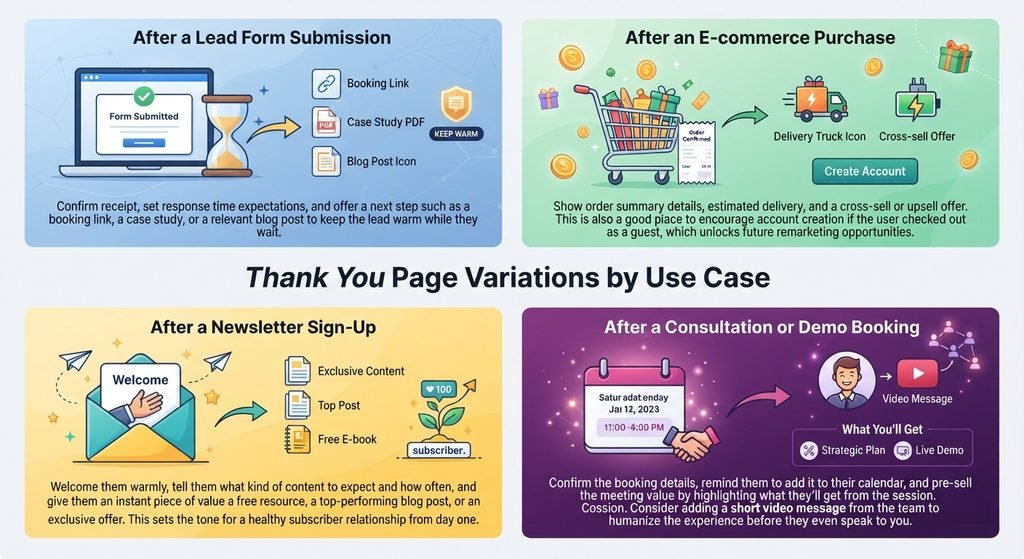
Thank You Page Variations by Use Case
After a Lead Form Submission
Confirm receipt, set response time expectations, and offer a next step such as a booking link, a case study, or a relevant blog post to keep the lead warm while they wait.
After an E-commerce Purchase
Show order summary details, estimated delivery, and a cross-sell or upsell offer. This is also a good place to encourage account creation if the user checked out as a guest, which unlocks future remarketing opportunities.
After a Newsletter Sign-Up
Welcome them warmly, tell them what kind of content to expect and how often, and give them an instant piece of value a free resource, a top-performing blog post, or an exclusive offer. This sets the tone for a healthy subscriber relationship from day one.
After a Consultation or Demo Booking
Confirm the booking details, remind them to add it to their calendar, and pre-sell the meeting value by highlighting what they’ll get from the session. Consider adding a short video message from the team to humanize the experience before they even speak to you.
Common Thank You Page Mistakes to Avoid
- Saying nothing useful: A bare-bones “Thank you” message wastes the moment entirely.
- Too many CTAs: More than one or two options creates decision paralysis. Keep it focused.
- No next step: Leaving the user with nowhere to go guarantees they’ll leave and likely forget about you.
- Inconsistent branding: Generic pages break the trust you’ve worked hard to build.
- Not tracking it: Your thank you page should be configured as a conversion goal in Google Analytics and any ad platforms you use. If you’re not tracking it, you’re flying blind on campaign performance.
How Thank You Pages Fit Into Your Broader Conversion Strategy
A thank you page doesn’t exist in isolation it’s part of a broader conversion ecosystem. The quality of your lead forms, pricing pages, landing pages, and homepage all contribute to who lands on your thank you page in the first place. Designing that full journey with intention is what separates high-performing websites from average ones.
If you’re building or refining that ecosystem, consider reading our guide on building a sales funnel that converts it provides a broader framework for connecting all the conversion touchpoints on your site, including your thank you page, into a cohesive revenue-generating system.
You should also review how your homepage introduces your brand to first-time visitors, since the expectations you set there directly influence the conversion actions that eventually lead someone to your thank you page. Our post on how to design a homepage that converts first-time visitors into customers covers this in detail.
Measuring Thank You Page Performance
Like every other page on your website, your thank you page should be measured and optimized over time. Key metrics to track include:
- Secondary CTA click rate: Are visitors actually engaging with your next step?
- Referral shares: How many users are sharing or referring?
- Time on page: Are visitors reading the content or bouncing immediately?
- Upsell or cross-sell conversion rate: For e-commerce, how many post-purchase offers are converting?
- Email open rates: If your thank you page mentions an incoming email, does your confirmation email get opened and clicked?
Run A/B tests on your secondary CTA copy, the placement of social proof, and the overall layout to find what resonates best with your specific audience.
Final Thoughts: Don’t Let the Conversation End at “Thank You”
The thank you page is not the end of the customer journey it’s the beginning of a deeper relationship. Every person who lands on that page has just demonstrated genuine interest in what you offer. How you respond to that interest in the next few seconds determines whether they become a loyal, high-value customer or simply a one-time transaction.
Invest in this page with the same seriousness you bring to your homepage, your pricing page, and your product pages. Clarify what happens next, provide genuine value, guide them toward a meaningful second step, and reinforce their decision with confidence-building content. Do that, and your thank you page stops being a dead end and starts becoming one of the most productive pages on your entire website.
Frequently Asked Questions
1. Why is thank you page design important for conversions?
A thank you page reaches visitors immediately after they take action, making it an ideal opportunity to build trust, encourage another conversion, and strengthen the customer relationship.
2. What should a high-converting thank you page include?
It should include a warm confirmation message, clear expectations, one relevant secondary CTA, social proof, and a clean, mobile-friendly design.
3. How can a thank you page increase revenue?
Relevant upsells, cross-sells, referral opportunities, and secondary offers can turn an initial conversion into additional revenue without requiring extra advertising spend.
4. Should thank you pages be personalized?
Yes. Personalizing the page with details such as the visitor’s name, purchase, booking, or submitted form can create a more relevant and trustworthy experience.
5. How can I measure the performance of a thank you page?
Track secondary CTA clicks, referral shares, time on page, upsell or cross-sell conversions, and email engagement, then use A/B testing to improve the page over time.