When a visitor lands on your website, you have fewer than 5 seconds to capture their attention, convey your core value proposition, and convince them to stay.
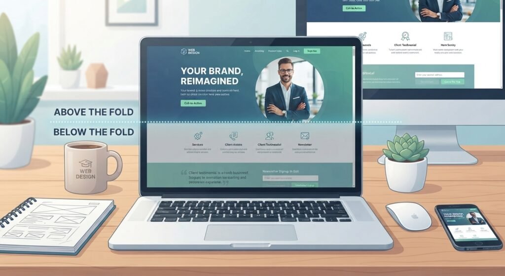
Where does that instant impression happen? Above the fold.
Whether you are building a custom SaaS platform, an e-commerce store, or a service agency website, the top section of your page acts as your digital storefront header. If your above-the-fold content is slow to load, cluttered, or confusing, users won’t scroll down to read the rest of your story; they will simply hit the Back button.In this ultimate guide, we will break down what it means in modern responsive web design, why it directly impacts your Google SEO rankings, and how to structure this critical screen real estate to maximize user engagement and sales.
What Does “Above the Fold” Mean in Web Design?
The term above the fold originates from the newspaper industry. High-impact headlines, breaking news, and primary photographs were placed on the top half of the front page so readers could see them while newspapers were folded on newsstands.In digital design and web development, it refers to the portion of a webpage that is visible on the user’s screen immediately upon loading, before they begin scrolling.
The Responsive Screen Challenge
Unlike printed paper, digital screens come in thousands of resolutions:
- Desktop Monitors: 1920×1080, 2560×1440, or ultrawide displays.
- Laptops: Standard 13-inch to 16-inch laptops (1366×768 or 1440×900).
- Mobile Devices: Smart phones ranging from compact screens to large phablets (375×812, 414×896).
Because viewports vary dramatically, the fold is no longer a fixed pixel line at 600px or 800px. Instead, modern responsive web development focuses on establishing a dynamic hero section that scales seamlessly across every screen type.
Why Above the Fold Content Is Crucial for Business Success
1. The 5-Second Attention Span & Bounce Rates
According to Google user experience studies, the majority of visitors decide whether to leave or stay within 3 to 5 seconds. If your above-the-fold design lacks clarity or fails to load quickly, your bounce rate increases. A confusing or slow above-the-fold experience can cause visitors to leave before engaging with the page. While bounce rate itself should not be treated as a direct Google ranking penalty, poor usability and page experience can hurt engagement and conversions.
2. Direct Impact on Google Core Web Vitals
Search engine optimization (SEO) is no longer just about keywords; it is heavily tied to technical page performance. Google’s Core Web Vitals measure how users experience the speed and stability of your page and your above-the-fold layout plays a direct role in these scores:
- Largest Contentful Paint (LCP): Measures how fast the main content element (hero image, background video, or primary headline) loads above the fold. To achieve a good score, LCP must happen within 2.5 seconds.
- Interaction to Next Paint (INP): Evaluates overall responsiveness when users interact with top-level navigation, search bars, or hero CTA buttons.
- Cumulative Layout Shift (CLS): Measures visual stability. If top banners, fonts, or images shift unexpectedly during load, your CLS score degrades.
3. Conversion Rate Optimization (CRO)
Your primary Call to Action (CTA) placed above the fold yields higher visibility than anywhere else on the page. Even though modern web users do scroll, placing your core offering and action steps ensures that 100% of your visitors see your most important value proposition.

1. An Immediate, High-Impact H1 Headline
Your headline should clearly answer three questions within seconds:
- What product or service do you offer?
- Who is it for?
- What specific problem or goal does it address?
Weak Headline: We Drive Innovation & Digital Excellence. (Vague, generic)
Strong Headline: Custom Web Development & SEO Solutions That Scale Your Business Revenue. (Direct, benefit-oriented)
2. A Supporting Subheadline
Your subheadline expands on the H1 by briefly clarifying your key features, turnaround speed, or unique value proposition (UVP). Keep this under 25 words.
3. A Strategic Call-to-Action (CTA) Button
Your primary CTA should be visually prominent, utilizing high-contrast background colors that stand out against the page layout.
- Use clear, action-driven copy: Get a Free Web Audit, Start Your Free Trial, or Book a Discovery Call.
- Avoid passive phrasing like Submit or Click Here.
4. High-Trust Social Proof Signals
Building immediate credibility above the fold significantly decreases bounce rates. Include compact trust badges directly beneath or adjacent to your CTA buttons:
- Customer rating stars (e.g., Rated 4.9/5 by 200+ clients)
- Client company logos or certification badges
- Verified security seals (especially critical for e-commerce checkouts)
5. Optimized Hero Visuals or Product Demos
Visual hierarchy is essential. Support your message with relevant visual content:
- SaaS & Tech Platforms: Interactive UI previews or product dashboard mockups.
- Service Agencies: Professional team photos or high-quality custom graphics.
- E-Commerce Brands: High-resolution product showcase shots highlighting key details.
7 Best Practices for Above the Fold Web Design in 2026
1. Optimize Hero Images for LCP
Heavy, uncompressed images are the leading cause of poor LCP scores and slow load times.
- Use Modern Image Formats: Convert JPG/PNG files to AVIF or WebP formats.
- Preload Critical Assets: Implement <link rel=preload> tags in your HTML <head> for primary hero images.
- Avoid Lazy-Loading Above the Fold: Never apply loading=lazy to your main hero image, as it delays rendering time. Use fetchpriority=high instead.
2. Implement Responsive Typography
Avoid hardcoded pixel font sizes (font-size: 48px;) for headlines. On smaller mobile displays, rigid text sizes can break layouts or push your primary CTA button below the visible screen area. Utilize modern CSS fluid typography techniques:
3. Keep Navigation Clean and Focused
Cluttered headers distract users from taking primary action. Limit main navigation links to 5–7 essential pages (e.g., Services, Portfolio, About, Blog, Contact). Place your primary conversion button prominently at the top-right corner of the navigation bar.
4. Avoid Heavy Hero Background Videos on Mobile
While autoplay background videos can look visually striking on desktop, they consume significant bandwidth, cause rendering lag, and ruin mobile Core Web Vitals scores. If using video, ensure it is heavily compressed, muted, sets playsinline, and falls back to a lightweight static WebP image on mobile viewports.
5. Eliminate Layout Shifts (CLS Defend)
Reserve explicit height and width dimensions for all elements above the fold. Load critical custom web fonts using font-display: swap; or system font fallbacks to prevent Flash of Unstyled Text (FOUT) and visual layout jumps during page rendering.
6. Design Mobile-First
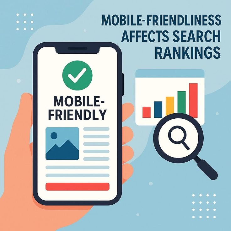
Mobile devices account for over 60% of web traffic worldwide. When structuring your hero section, design the mobile experience first:
- Ensure text sizes remain legible without pinch-zooming.
- Keep CTA buttons at least 48×48 pixels for easy touch targets.
- Ensure primary headlines and buttons fit on standard mobile viewports (e.g., 375×667px) without requiring immediate scrolling.
7. A/B Test Headline & CTA Variations
What works for one audience may not resonate with another. Use A/B testing tools (such as Google Looker, VWO, or PostHog) to test different headline hooks, button color contrasts, and hero visual formats to find the combination that maximizes conversions.
Common Above the Fold Mistakes to Avoid
| Mistake | Why It Hurts Performance & SEO | Recommended Fix |
| Overloading Content | Flooding the top screen with text, banners, and links creates visual confusion and cognitive fatigue. | Use ample whitespace and focus on a single primary value proposition. |
| Hiding Primary CTAs Below the Fold | Forcing users to scroll down to find out how to take action leads to missed leads. | Ensure a clear primary button is instantly visible on screen load. |
| Generic Stock Photography | Uninspired stock photos ruin trust and make your business appear unauthentic. | Use real product screenshots, custom illustrations, or professional photography. |
| Uncompressed Large Assets | 5MB hero images stall page rendering, resulting in failed Google Core Web Vitals checks. | Keep critical hero assets as small as practical while maintaining the required visual quality, and serve appropriately sized WebP or AVIF images. |
| Intrusive Popups & Sticky Banners | Full-screen promotional popups on load block core content, triggering Google’s intrusive interstitial penalty. | Delay popups until user intent is shown (e.g., exit-intent or 50% scroll depth). |
Real-World Examples: Above the Fold Done Right
Example A: B2B SaaS Platform
- Headline: Automate Your Financial Reporting in Minutes
- Subheadline: Connect your accounting tools, generate real-time balance sheets, and eliminate manual spreadsheet errors.
- Hero Visual: An interactive dashboard mockup showing real-time revenue charts.
- Social Proof: Logos of recognized financial institutions using the platform.
- Why it Works: Answers what, why, and how within 3 seconds, backed by high-trust brand logos.
Example B: Digital Agency / Custom Web Development
- Headline: Custom Web Development Solutions Built for Scalability & Speed
- Subheadline: We design, build, and optimize high-converting custom websites tailored to grow your revenue.
- CTA: Get a Free Website Strategy Session
- Social Proof: ★★★★★ 5.0 Rating badge from verified client reviews.
- Why it Works: Clear focus on revenue outcomes rather than technical jargon, making the offer irresistible to business decision-makers.
Technical Checklist for Web Developers & Designers
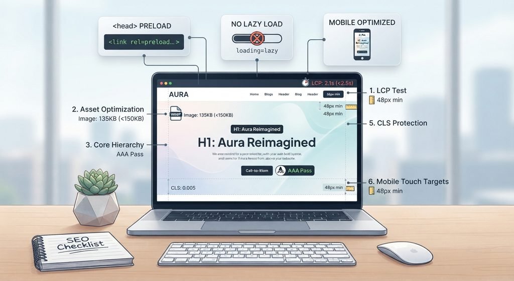
Before publishing your site, audit your above-the-fold layout against this technical web development checklist:
- LCP Test: Hero section loads in less than 2.5 seconds on mobile 4G speeds.
- Asset Optimization: Primary hero graphic is in WebP/AVIF format and under 150KB.
- Preload Tag: Essential hero image or background CSS has preloading tags enabled in <head>.
- No Lazy Loading: Hero image does not contain loading=lazy.
- Core Hierarchy: H1 tag is unique, present, and contains primary target keywords.
- Contrast Ratio: Text and CTA buttons pass WCAG AAA color contrast guidelines.
- CLS Protection: Images and dynamic content containers have defined width and height CSS attributes.
- Mobile Touch Targets: All header links and buttons are at least 48px in height.
How WebHivez Helps Build High-Ranking, High-Converting Websites
At WebHivez, we specialize in crafting custom digital experiences, high-performance web development, and search engine optimization strategies tailored to grow your business online.
Whether you need a complete website redesign, speed optimization to conquer Google’s Core Web Vitals, or a conversion-focused landing page, our team combines technical performance with user experience design to deliver measurable business results.
Ready to transform your website’s performance?
Explore Our Web Development & SEO Services at Webhivez and claim your free digital audit today!
Frequently Asked Questions
1. What pixel height is considered for above the fold?
There is no single pixel height due to varying device screen sizes. However, standard design benchmarks target the top 600px to 800px on desktop screens and the top 500px to 650px on mobile viewports as primary screen real estate.
2. Does above-the-fold design affect SEO?
Above-the-fold design can affect user experience, performance, and engagement, which are important considerations for search visibility. However, Google does not have a specific above-the-fold design penalty. Page experience should be evaluated as a whole, including Core Web Vitals, mobile usability, intrusive interstitials, and the accessibility of the main content.
3. Should I put my primary CTA above the fold?
In many cases, placing the primary CTA above the fold can make the desired action easier to discover. However, the right placement depends on the page type, audience, and complexity of the offer.
4. Can I use slider carousels above the fold?
It is generally recommended to avoid hero image sliders. Studies show that sliders decrease conversion rates because users rarely wait for auto-rotating slides, and heavy slider JavaScript libraries slow down page rendering speed and LCP performance. Stick to a static, high-impact hero image or product preview.