Why Your Blog Page Design Matters More Than You Think
Most businesses invest heavily in crafting great content but almost nothing in the design of the page that houses it. That’s a costly mistake. Your blog page is not just a list of articles it’s a discovery engine, a trust-building tool, and a conversion asset rolled into one. If it’s cluttered, slow, or confusing, readers leave before they ever find the post that would have turned them into a customer.
Done well, a well-designed blog page increases time on site, reduces bounce rate, improves SEO authority, and moves visitors naturally toward your offers. This guide covers every element you need to get that right from layout to filtering, from typography to CTAs.
Start With a Clear Layout Architecture
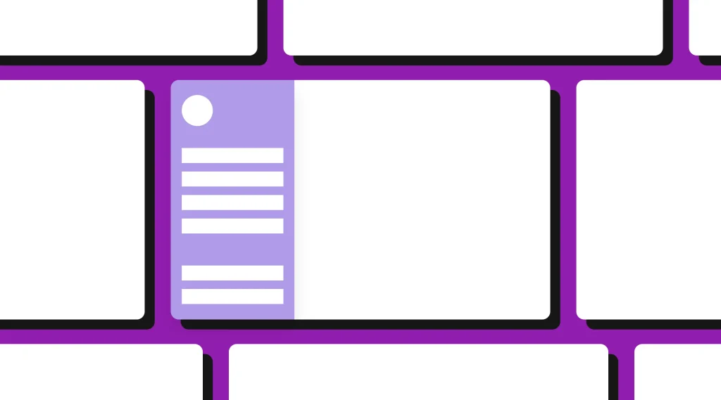
Before touching colors or fonts, you need to decide how your blog page will be structured. Layout architecture determines how readers scan, browse, and ultimately click. There are three primary layouts to consider:
- Grid layout: Displays posts in a two- or three-column card format. Works best for image-heavy blogs with a large content library. Visually rich and easy to scan.
- List layout: Stacks posts vertically with a thumbnail, title, excerpt, and metadata. Better for SEO-focused or text-heavy content where summaries drive click-throughs.
- Magazine layout: Combines a featured hero post at the top with a grid or list below. Excellent for showcasing editorial picks while maintaining browsability.
Choose based on your content type and audience. A business service blog may perform better with a clean list layout. An ecommerce brand or lifestyle brand typically benefits from an image-forward grid. There is no universal answer but there is a wrong answer for every brand, and it usually involves defaulting to whatever your theme came with.

Design the Blog Card With Intention
Every post on your blog page is represented by a card or list item. That card has to do a lot of work: it needs to communicate value, spark curiosity, and earn a click all within a few square inches of screen space.
Elements Every Blog Card Should Include
- Featured image: Relevant, high-quality, and consistently sized. Inconsistent image dimensions break visual rhythm and look unprofessional.
- Post title: The single most important element. It should be clear, benefit-driven, and large enough to read at a glance.
- Short excerpt: Two to three sentences that expand on the title without giving everything away. Its job is to deepen curiosity, not summarize the post.
- Category or tag label: Helps readers self-segment and understand what type of content they’re looking at.
- Estimated read time or publish date: Sets expectations and signals freshness. Read time in particular significantly increases click-through rates.
- Author name or avatar (optional): Adds a human element and builds authority, especially important for professional service brands.
Avoid cluttering the card with social share counts, comment numbers, or excessive metadata. Every element must earn its place by supporting the decision to click.
Use Category and Tag Filtering to Improve Discoverability
If your blog has more than fifteen to twenty posts, navigation without filtering becomes a browsing nightmare. Readers who can’t find what they’re looking for leave and they don’t come back. Category filters solve this at scale.
Design your category navigation as a horizontal tab bar directly above the post grid or list. Keep category labels short and scannable: “Design,” “SEO” “Ecommerce,” “Strategy.” Avoid nested dropdowns on the blog index they create friction and slow discovery.
Tags work differently from categories. While categories are broad buckets, tags are specific topics within those buckets. Display tags on individual post pages rather than the main blog index. Using both thoughtfully creates an internal discovery system that boosts pageviews per session and improves your internal linking strategy for SEO simultaneously.
Featured Posts and Editorial Curation
Not all content is equal. Your blog page should reflect that. Use a “Featured Post” hero section at the top of the page to spotlight your best or most strategic piece of content whether that’s your highest-converting post, your most-shared guide, or the article that best represents your brand’s expertise.
This hero section should be visually distinct from the rest of the blog grid. A full-width banner with a large image, prominent headline, and short description works exceptionally well. Think of it like a magazine cover it sets the editorial tone and anchors the page.
You can also include an “Editor’s Picks” or “Most Popular” section below the main grid. These curated sections reduce decision fatigue for first-time visitors who don’t know where to start. They guide attention without overwhelming.
Sidebar Strategy: Use It or Lose It
The sidebar is one of the most debated elements in blog design. Used correctly, it adds real value. Stuffed with ads, unrelated widgets, and outdated social feeds, it destroys credibility and distracts from your content.
Sidebar Elements That Actually Convert
- Email opt-in form: The single highest-ROI element you can place in a sidebar. Keep it simple one field for email, a clear benefit statement, and a strong CTA button.
- Popular or related posts: Helps readers find more content and increases pages per session.
- Search bar: Essential for content-heavy blogs. A well-designed website search bar dramatically reduces the effort required to find specific information.
- Category navigation: Repeat the category filters here for visitors who’ve scrolled past the top.
- A soft CTA for your service or product: A simple banner linking to a core service page keeps the commercial path visible without being aggressive.
On mobile, the sidebar should collapse below the main content or disappear entirely. Never force mobile readers to scroll through a sidebar before they reach what they came for.
Pagination vs. Infinite Scroll vs. Load More
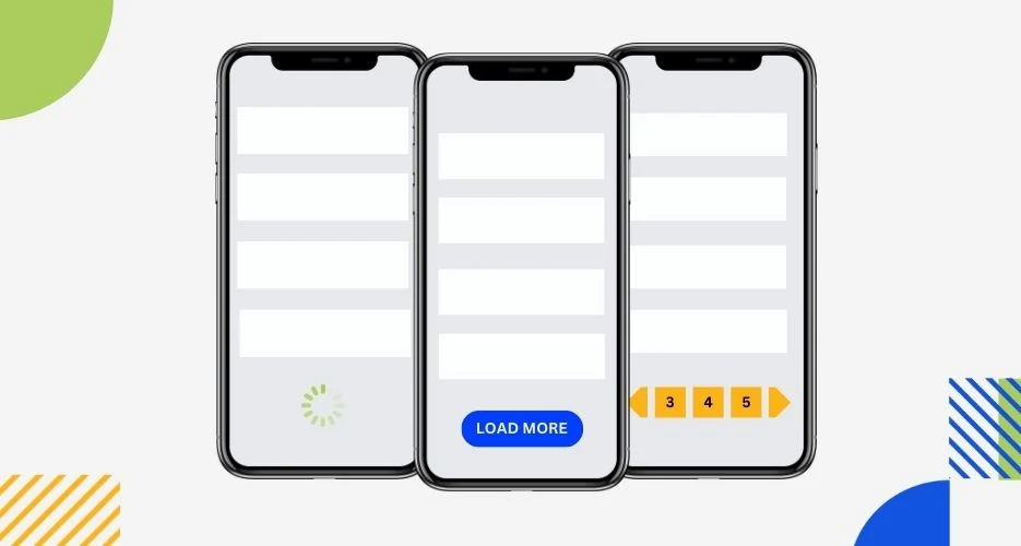
How you handle content loading beyond the first page has real UX and SEO implications. Here’s how each option stacks up:
- Traditional pagination: Creates discrete pages (Page 1, Page 2, etc.). Best for SEO because each page gets its own URL that search engines can crawl. Familiar to users and easy to bookmark.
- Infinite scroll: New posts load automatically as you scroll. Creates a seamless browsing experience but can confuse users trying to return to a specific post. Also creates crawling challenges for search engines.
- Load More button: A hybrid approach. Content stays on one URL, but new posts only load on demand. Good UX, but can have similar SEO limitations to infinite scroll.
For most business blogs with SEO goals, traditional pagination is the safest choice. If you prefer a modern feel, a “Load More” button is a reasonable compromise just ensure that loaded content is crawlable if you care about ranking individual posts.
Typography and Readability on the Blog Index
The blog index page is primarily a scanning experience, not a reading one. That changes your typography priorities. You’re optimizing for skimmability and hierarchy rather than long-form readability.
Post titles should be large, bold, and high-contrast. Excerpts should be set in a lighter weight at a slightly smaller size to create clear visual hierarchy. Line-height on excerpts should be generous at least 1.5x to prevent the text from feeling dense or intimidating at a glance.
Limit the fonts on your blog index to two: one for headings, one for body text. Anything more creates visual noise that competes with your content for attention. For a deep dive on making typography work across your site, see our guide on using typography in web design to improve readability and conversions.
Strategic CTAs on the Blog Page
Your blog page should never just be a content archive. It’s a conversion surface. The question is where and how to place calls-to-action without disrupting the browsing experience.
Where to Place CTAs on Your Blog Page
- Header area: A sticky header with a soft CTA (“Get a Free Audit,” “Talk to Us”) keeps your offer visible without interrupting content browsing.
- After the featured post: A banner or inline CTA between the hero post and the main grid converts readers who are already engaged.
- Email opt-in within the grid: Some blogs insert an email capture card every six to eight posts in the grid. When designed to match the card style, it feels native rather than intrusive.
- Sidebar and footer: Persistent but passive placements that capture visitors in decision mode.
The key is that CTAs should feel like a natural extension of the value you’re already providing not a hard sell layered on top of content. If your blog builds genuine trust, readers will welcome a relevant offer.
Performance and Page Speed
A blog page with dozens of post thumbnails, lazy-loaded content, and a sidebar full of widgets can become sluggish fast. And speed is not optional every extra second of load time directly reduces engagement and conversions, as we cover in detail in our analysis of page speed and its impact on conversions.
Optimize blog page performance by:
- Using next-gen image formats (WebP) for all featured images
- Implementing lazy loading so below-the-fold images only load when needed
- Limiting third-party scripts in your sidebar (social feeds, comment systems, ad networks)
- Using a content delivery network (CDN) to serve assets from geographically close servers
- Caching the blog index page aggressively since it changes less frequently than dynamic pages

Mobile-First Blog Design
More than half of blog traffic comes from mobile devices, yet blog pages are frequently designed on a desktop and “adapted” for mobile as an afterthought. That approach produces mediocre experiences that lose readers before they find value.
Design for mobile first by starting with a single-column card layout, large touch-friendly titles, and generous spacing between elements. Category filters should become a horizontally scrollable pill navigation on mobile never a dropdown. The sidebar should be hidden or collapsed below the fold. Featured images should be aspect-ratio controlled to prevent layout shifts as content loads.
Test your blog page on real devices, not just browser simulators. Tap targets, font sizes, and scroll behavior often reveal problems that don’t show up on desktop previews.
SEO Optimization for the Blog Index Page
The blog index itself is a rankable page but only if you treat it with the same SEO discipline you’d apply to any other page. Start with a clear H1 that incorporates your primary topic. Add a short introductory paragraph (two to four sentences) below the H1 that describes what the blog covers and who it’s for. This gives search engines context and improves topical relevance.
Ensure your blog index has a proper meta title and description. Use your schema markup to identify it as a Blog or Collection page type. And make sure your pagination creates proper canonical tags and next/prev markup so search engines understand the relationship between blog index pages.
Turning Blog Readers Into Business Leads
The ultimate goal of your blog page is not just to display content it’s to move people toward a business relationship. That happens through a combination of trust-building content, strategic internal linking, and well-placed conversion paths.
When readers find multiple posts that answer their questions, they begin to see your brand as the authority in the space. When they see consistent design quality, professional copywriting, and clear CTAs, they make the mental leap from “this is useful content” to “I should work with these people.” That’s the conversion journey your blog page should be designed to support from the first visit.
Every element from the card design to the sidebar opt-in to the category navigation should be working toward the same goal: giving readers a reason to stay, explore, and eventually reach out. A blog page that achieves this doesn’t just drive traffic. It drives revenue.
Final Thoughts
Designing a high-performing blog page requires the same strategic thinking you’d bring to any core conversion page on your site. It’s not a set-it-and-forget-it archive it’s a dynamic, living part of your digital presence that shapes how visitors perceive your brand and whether they decide to go deeper.
Invest in the layout, the card design, the filtering system, the CTAs, and the performance. Test and iterate based on real user behavior. And remember: your blog is only as powerful as the page that delivers it. Get that page right, and everything else compounds.
Frequently Asked Questions
Why is blog page design important for a website?
A well-designed blog page helps visitors discover content easily, increases engagement, builds trust, and guides readers toward your products or services.
What layout is best for a blog page?
Grid, list, and magazine layouts can all work well. The best choice depends on your content type, audience, and how visitors prefer to browse your articles.
What should a blog card include?
A strong blog card should include a relevant featured image, clear title, short excerpt, category or tag, and useful metadata such as publish date or estimated reading time.
How can I improve blog content discoverability?
Use clear category filters, featured posts, related content, search functionality, and strategic internal linking to help visitors quickly find relevant articles.
How can a blog page generate more business leads?
Strategic CTAs, email opt-ins, internal links, service promotions, and well-placed conversion paths can turn blog readers from content consumers into potential customers.