What Does “Above the Fold” Actually Mean?
The term “above the fold” originates from the newspaper industry. When broadsheets were stacked at newsstands, only the top half — the portion above the physical fold — was visible. Editors placed the most important headlines there to grab attention before a single copy was picked up.
In web design, above the fold refers to everything a visitor sees on your webpage before they scroll. The exact boundary shifts depending on screen resolution, device type, and browser settings — but the principle remains the same: this is prime real estate, and what you put there determines whether visitors stay or leave.
In a world where users form opinions about a website in roughly 50 milliseconds, above-the-fold design isn’t a minor detail. It’s one of the most consequential decisions you’ll make for your site’s performance.
Why Above-the-Fold Design Matters for Conversions
The data is consistent and clear: visitors spend the majority of their time viewing content above the fold. According to research from the Nielsen Norman Group, users spend approximately 57% of their page-viewing time above the fold and only 17% on content between the first and second screenfuls. Engagement drops significantly after that.
What this tells us is simple — if your above-the-fold section fails to communicate value, establish trust, and motivate action, a large percentage of visitors will bounce without ever scrolling. That’s lost traffic, wasted ad spend, and missed conversions.
This is directly connected to bounce rate. A poorly designed hero section with a vague headline, slow loading images, or no clear call to action sends users back to Google almost immediately. If you’ve been struggling with high bounce rates, the answer often starts at the top of the page. Our guide on 10 proven ways to reduce website bounce rate covers this in depth, and above-the-fold improvements consistently appear among the most impactful fixes.
The 6 Core Elements of Effective Above-the-Fold Design
Not every page has the same goals, but most above-the-fold sections need to accomplish six things to perform well. Here’s what to include and why each element earns its place.
1. A Clear, Benefit-Driven Headline
Your headline is the first piece of copy a visitor reads. It should answer one question immediately: “What do I get from this?” Generic headlines like “Welcome to Our Website” or “We Build Websites” communicate almost nothing. Strong headlines are specific, audience-focused, and benefit-led.
Examples of the difference:
- Weak: “Digital Marketing Solutions for Businesses”
- Strong: “Get More Leads Without Increasing Your Ad Budget”
A compelling headline sets the frame for everything below it. It should match what your visitor was searching for or expecting based on the ad, link, or recommendation that brought them to your page. Mismatched messaging between your traffic source and your headline is one of the fastest ways to lose a qualified visitor.
2. A Supporting Subheadline
Your subheadline does the heavy lifting of clarifying and expanding on the headline. If the headline creates intrigue or makes a bold promise, the subheadline delivers the context. It should be one to two sentences maximum and answer the natural follow-up question your headline raises.
Think of it as: headline = the hook, subheadline = the reason to believe it.
3. A Primary Call to Action (CTA)
Every above-the-fold section needs one clear CTA. Not two. Not a navigation menu with six options and a newsletter signup. One primary action that you want the majority of visitors to take next.
The CTA button should be:
- Visually distinct — high contrast against the background
- Action-oriented in its copy — “Start My Free Trial,” not “Submit”
- Positioned logically after the headline and subheadline
- Specific about what happens next — remove ambiguity
CTA design and copy are nuanced disciplines on their own. If you want to go deeper, our guide on CTA optimization: what actually works breaks down the psychology and testing strategies that drive real results.
4. A Compelling Hero Visual or Video
Humans process visual information approximately 60,000 times faster than text. The image or video in your hero section communicates tone, credibility, and relevance almost instantly — before your visitor reads a single word.
Effective hero visuals typically fall into one of these categories:
- Product in use: Show the product being used in a relevant context, not just isolated on a white background
- Outcome illustration: Visualize the result your customer gets — a cleaner home, a growing revenue chart, a smiling team
- People and faces: Human faces build immediate trust and emotional connection
- Interface or dashboard screenshot: Common for SaaS products — give visitors a preview of what they’re signing up for
What to avoid: generic stock photography that could belong to any company in any industry. If the image on your hero section could be swapped onto a competitor’s page without anyone noticing, it’s not doing its job.
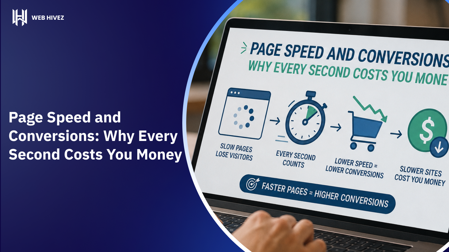
Also critical — that hero image or video must load fast. A visually stunning hero section that takes four seconds to appear will destroy your conversion rate before anyone sees it. This is explored in detail in our post on page speed and conversions: why every second costs you money.
5. Trust Signals
Trust signals reduce the psychological friction that prevents visitors from taking action. They communicate: “Other people have trusted this company — it’s safe to trust them too.”
Common above-the-fold trust signals include:
- Client logos or “As Seen In” media mentions
- Star ratings and review counts (e.g., “4.9 stars across 500+ reviews”)
- A short social proof statement (“Trusted by 10,000+ businesses”)
- Security badges or certifications relevant to your industry
- Awards or recognition
You don’t need all of these — pick the two or three that are most credible and relevant to your specific audience. Overloading the hero section with badges can actually signal insecurity rather than confidence.
6. Navigation That Guides Without Distracting
Your navigation bar is technically above the fold, but it should complement the hero section rather than compete with it. Overly complex navigation with too many options creates decision paralysis and distracts visitors from your primary CTA.
Best practices for above-the-fold navigation:
- Keep menu items to five or fewer top-level options
- Make the CTA button in the nav visually distinct from regular menu links
- Ensure the logo links back to the homepage
- Use a sticky or fixed nav so it remains accessible as users scroll
Above-the-Fold Design for Different Page Types
The specific elements and their weighting change depending on what type of page you’re designing. Here’s how to adapt the core principles.
Homepage
The homepage hero needs to communicate who you are, who you serve, what you do, and why you’re different — all within seconds. The balance here leans toward clarity and broad appeal. You’re speaking to multiple audience segments simultaneously, so your messaging needs to be inclusive without being vague.
Landing Pages
Landing pages for specific campaigns or offers have a singular focus. There’s typically no main navigation (to eliminate escape routes), and the above-the-fold section is laser-focused on one offer, one audience, and one CTA. Every element should reinforce that single conversion goal. Understanding what makes a high-converting landing page goes hand-in-hand with mastering above-the-fold design specifically for campaigns.
Product or Service Pages
On product and service pages, the above-the-fold section should immediately confirm that the visitor has found the right page. State the product name, its core benefit, price if appropriate, and provide a strong CTA. Trust signals here often include specific reviews related to that product or service rather than general brand credibility.
Blog Posts
Blog posts have a different objective — they need to convince the reader that the article is worth their time. Above the fold on a blog post should include: the headline (which should itself be compelling), author information and publish/update date for credibility, a featured image, and ideally a brief intro paragraph that hooks the reader immediately.
Common Above-the-Fold Design Mistakes to Avoid
Even experienced designers fall into these traps. Knowing them upfront will save you significant testing time and lost conversions.
- Prioritizing aesthetics over clarity: A hero section can be visually stunning and still fail completely if visitors can’t immediately understand what you offer.
- Too many CTAs: Giving users three or four options to choose from above the fold splits their attention and reduces the likelihood that they’ll take any action.
- Slow-loading hero images or videos: A large, unoptimized background video is one of the most common causes of poor Core Web Vitals scores and high bounce rates.
- Text over low-contrast backgrounds: Beautiful gradient images often make headline text nearly unreadable. Legibility always wins over visual elegance.
- Designing only for desktop: A hero section that looks perfect on a 1440px monitor may be completely broken on mobile. With more than half of web traffic coming from mobile devices, mobile-first design is non-negotiable.
- Generic stock photography: As mentioned earlier — if the image could belong to anyone, it adds no trust or specificity to your brand.
- Vague or jargon-heavy headlines: “Innovative solutions for the modern enterprise” tells nobody anything useful. Speak in plain language about real outcomes.
How to Test and Optimize Your Above-the-Fold Design
Great above-the-fold design is not a one-time task. It’s an ongoing process of testing, measuring, and iterating. Here’s a practical framework:
Start with the Five-Second Test
Show your above-the-fold section to someone unfamiliar with your business for exactly five seconds, then ask: “What does this company do? Who is it for? What are you supposed to do next?” If they can’t answer clearly, you have a messaging or hierarchy problem.
Run A/B Tests on High-Impact Elements
Focus your testing energy on the elements that have the greatest potential impact: headline copy, CTA button text, CTA placement, hero image or video, and trust signal placement. Test one variable at a time to get clean, actionable data.
Use Heatmaps and Scroll Maps
Tools like Hotjar or Microsoft Clarity show you exactly where users are clicking and how far they scroll. If your heatmap shows most clicks going to a secondary element rather than your primary CTA, you have a visual hierarchy issue worth addressing.
Monitor Core Web Vitals
Google’s Core Web Vitals — particularly Largest Contentful Paint (LCP) — are directly tied to your above-the-fold performance. LCP measures how long it takes for the largest visible element (usually your hero image) to load. Poor LCP scores hurt both your rankings and your conversion rate simultaneously.
The Relationship Between Above-the-Fold Design and SEO
Above-the-fold design doesn’t just affect conversions — it directly influences your search engine rankings. Google’s Page Experience signals include metrics that are largely determined by what happens above the fold: LCP (load speed of the main visual), CLS (Cumulative Layout Shift — visual stability as the page loads), and FID/INP (interactivity responsiveness).
Beyond technical performance, Google evaluates the quality and relevance of above-the-fold content as part of its overall page quality assessment. Pages that bury their primary content below aggressive ad placements or decorative sections are penalized through what Google calls the “page layout algorithm.”
The intersection of design and SEO is deeper than most people realize. If you want to understand how these two disciplines reinforce each other, how web design and SEO work better together is essential reading.
Bringing It All Together: An Above-the-Fold Design Checklist
Before you publish or launch any page, run through this checklist for the above-the-fold section:
- ✅ Headline is specific, benefit-driven, and immediately clear
- ✅ Subheadline expands and supports the headline without repeating it
- ✅ One primary CTA is present, visually distinct, and uses action-oriented copy
- ✅ Hero visual is relevant, high-quality, and optimized for fast loading
- ✅ At least one trust signal is present (reviews, logos, social proof)
- ✅ Navigation is clean, minimal, and not competing with the CTA
- ✅ Design is tested on mobile, tablet, and multiple desktop resolutions
- ✅ Text is legible against all backgrounds with adequate contrast
- ✅ LCP score is under 2.5 seconds
- ✅ CLS score is below 0.1 (no visual layout shifts as the page loads)
Conclusion: Your Above-the-Fold Section Is Your First — and Most Important — Impression
Everything we’ve covered comes back to one core truth: above-the-fold design is where first impressions are made, trust is established, and conversion momentum begins. No amount of excellent content below the fold can save a hero section that fails to communicate value within the first few seconds.
The good news is that above-the-fold design follows clear, learnable principles. When you combine a specific benefit-driven headline, a supporting subheadline, a single strong CTA, a relevant hero visual, meaningful trust signals, and clean navigation — all optimized for speed and mobile — you create an above-the-fold experience that converts.
Don’t treat this section as a design exercise. Treat it as your highest-leverage business asset on the web. Test it rigorously, measure what matters, and keep improving. The difference between a hero section that converts at 2% and one that converts at 8% is not luck — it’s intentional, informed design decisions made one element at a time.
Frequently Asked Questions (FAQs)
What is above-the-fold in web design?
Above-the-fold refers to the section of a webpage that is visible to users before they scroll. It is the most important area for grabbing attention and communicating value instantly.
Why is above-the-fold design important for conversions?
Above-the-fold design directly impacts conversions because it creates the first impression. A clear headline, strong CTA, and engaging visuals can encourage users to stay and take action.
What should be included above the fold?
An effective above-the-fold section should include a benefit-driven headline, supporting subheadline, one primary CTA, a relevant hero image or video, and trust signals like reviews or client logos.
How does above-the-fold design affect SEO?
Above-the-fold design affects SEO through user experience and Core Web Vitals like page speed and visual stability. Poor performance can increase bounce rate and hurt rankings.
What are common above-the-fold design mistakes?
Common mistakes include slow-loading images, vague headlines, too many CTAs, poor mobile optimization, and using generic stock visuals that fail to build trust.