Why Your Hero Section Is the Most Important Part of Your Website
You have roughly three to five seconds to convince a visitor to stay on your website. That window is almost entirely determined by one thing: your hero section. It is the first visual block a visitor encounters when they land on any page, and it sets the tone for everything that follows.
A poorly designed hero section creates instant confusion. A visitor who cannot immediately understand what you do, who you serve, and why they should care will bounce often permanently. A well-designed hero section, on the other hand, creates instant clarity, builds desire, and pulls the visitor deeper into your site. This guide breaks down every critical element of hero section design, from layout and copy to imagery and calls to action. Whether you are building a new site from scratch or auditing an existing one, this is the framework you need. What a Hero Section Actually Needs to Accomplish Before diving into specific design decisions, it helps to understand the job a hero section is doing. It is not simply decorative. Every component must serve at least one of the following functions:
- Communicate your value proposition instantly visitors should know what you offer within seconds.
- Establish relevance they need to feel this is for them, not a generic audience.
- Build credibility signals subtle cues that make you look trustworthy and professional.
- Drive a specific action guide the visitor toward one clear next step.
- Set the visual tone the design language introduced here will carry through the rest of the site.
When any one of these is missing or poorly executed, your conversion rate suffers. Understanding this hierarchy helps you make purposeful design decisions rather than aesthetic ones.
The Core Elements of a High-Performing Hero Section
1. A Headline That Leads With Outcome, Not Process
Your headline is the single most important piece of copy on your website. Most businesses make the mistake of writing headlines that describe what they do rather than what the visitor gains. “We Build Websites” tells the visitor your process. “Turn Your Website Into Your Best Salesperson” tells them the outcome. The best headlines are specific, benefit-driven, and written in the language your ideal customer uses. Avoid jargon, avoid trying to be clever at the expense of clarity, and never make visitors work to understand you.
A strong headline formula: [Desired outcome] for [target audience] [without/even if/faster than] [common objection or barrier]. Not every headline will follow this exactly, but this structure forces you to think like your customer rather than like your company.
2. A Supporting Subheadline That Adds Specificity
The subheadline sits beneath your main headline and has one job: add the detail that the headline could not carry. If your headline is emotionally driven and big-picture, the subheadline should become concrete and specific. It should briefly explain how you deliver the promised outcome, who you serve, or what makes your approach different. Keep it to two or three sentences maximum. If you find yourself writing more, your headline is not doing enough heavy lifting.
3. A Primary Call to Action That Is Unmistakably Clear
Every hero section needs one primary call to action (CTA). Not two, not three one. Decision fatigue is real, and presenting visitors with multiple competing options at the very first moment of engagement is one of the fastest ways to kill conversions. Your CTA button should use action-oriented language that reinforces the benefit. “Get My Free Quote,” “Start Growing Today,” and “See How It Works” all outperform generic labels like “Submit” or “Learn More.” The button should be visually dominant sized and colored to stand apart from every other element on the page.
If you want to offer a secondary action (such as watching a demo video), make it visually subordinate to the primary CTA. A text link or ghost button works well for this secondary option without competing with your main conversion goal. For a deeper look at optimizing calls to action across your site, CTA optimization strategies that actually work is worth reading in full.
4. Hero Imagery or Visual That Reinforces the Message
The visual component of your hero section whether a photograph, illustration, video, or abstract graphic needs to do more than look good. It should reinforce what the copy is saying. Consider what emotion or outcome you want the visitor to associate with your brand. A business coaching company might use an image of a confident professional in a modern office. A software product might use a clean, bright product screenshot that shows the interface in action. An e-commerce brand might lead with lifestyle photography that puts the product in an aspirational context.
Avoid stock photography that looks generic or overly posed. Authentic, specific imagery consistently outperforms polished but hollow visuals. If your budget allows, invest in custom photography or a well-designed product illustration it pays for itself many times over in improved trust and conversions.
5. Social Proof Embedded at the Hero Level
One of the highest-impact additions you can make to a hero section is a subtle but powerful social proof element. This does not mean a full testimonial it means a brief trust signal that validates your credibility before the visitor has scrolled a single pixel.
Examples of hero-level social proof include:
- Star ratings with a short review summary (“Rated 4.9/5 by 300+ customers”)
- Client logos from recognizable brands you have worked with
- A single powerful stat (“Trusted by 10,000+ businesses in 40 countries”)
- Award badges or press mentions
- A short pull-quote from a well-known client
These elements should be compact and visually clean they exist to lower skepticism, not to steal attention from your CTA. For a comprehensive breakdown of how to use social proof throughout your site, see our guide on using social proof to build trust and drive conversions.
Layout and Composition Principles for Hero Sections
Left-Aligned vs. Centered Layouts
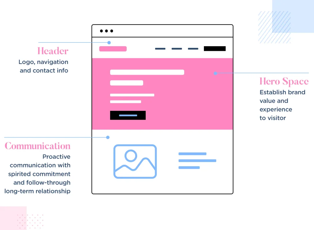
Hero sections typically use one of two layout approaches: centered or left-aligned with the visual on the right. Both can be highly effective, but they work best in different contexts.
Centered layouts work well for bold, minimalist designs where the headline is the dominant feature. They feel editorial and confident, and they work particularly well for SaaS products, creative agencies, and brands with a strong design identity. Left-aligned layouts with a visual on the right are the most common structure for service businesses and product companies. The text draws the eye first, and the visual supports and contextualizes the message. This layout also tends to perform well on mobile, where the image drops below the copy and the hierarchy remains intact.
Above the Fold: What Stays Visible Before Scrolling
Everything in your hero section that sits above the fold meaning visible without scrolling must be capable of communicating your complete value proposition. If a visitor does nothing but glance at your hero section and then close the tab, they should still leave with a clear sense of what you offer and why it matters. This means every element above the fold is premium real estate. Avoid filling it with large decorative images that push copy down, navigation bars with too many items, or multiple competing visual focal points. Keep it clean, keep it focused, and keep the most important message front and center. Our guide on above-the-fold web design best practices goes deep on this critical area of your page.
Using White Space Strategically
One of the most common mistakes in hero section design is overcrowding. Designers and business owners alike feel the pressure to include every selling point in the hero resulting in a cluttered, overwhelming first impression. White space is not wasted space; it is a design tool that directs attention, creates breathing room, and signals confidence. Give your headline room to breathe. Separate your CTA from the subheadline with sufficient spacing. Let the visual element sit in a composition that feels intentional rather than crammed. Restraint in the hero section almost always outperforms maximalism.
Typography and Color Choices That Strengthen the Hero
Your hero section is where typography and color have the greatest impact because it is seen first. Bold, well-chosen typefaces create immediate authority. A headline set in a large, clean sans-serif font at 48 to 72 pixels reads instantly and leaves an impression. Body text in the hero should be 16 to 18 pixels minimum for comfortable readability across devices. Color in the hero section should establish your brand palette while ensuring maximum contrast between text and background.
A dark headline on a light background or light text on a rich, deep background both work well. What does not work is low-contrast combinations that force visitors to strain to read. Your CTA button should use your most high-contrast, action-oriented brand color. If you want to go deeper on how color choices drive behavior, our post on using color psychology in web design to drive more conversions covers the science and strategy in detail.
Mobile Optimization for Hero Sections
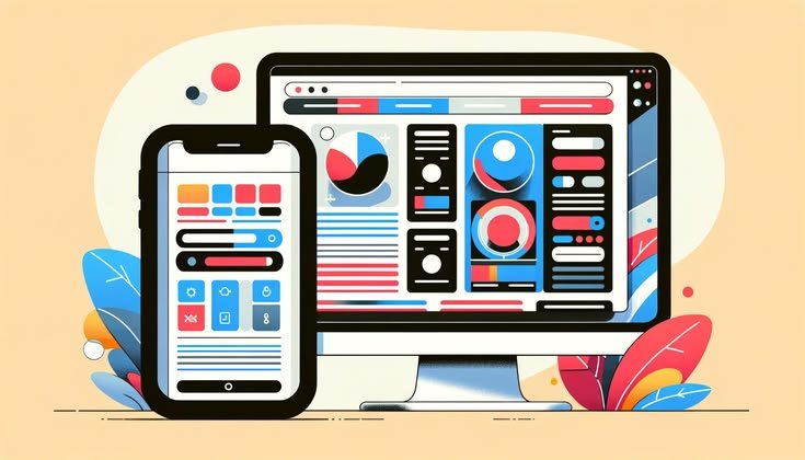
More than half of all web traffic now comes from mobile devices, which means your hero section must be designed with mobile as a primary consideration, not an afterthought. On smaller screens, several things change:
- Large images often become visual noise consider simplifying or cropping them for mobile viewports.
- Headlines need to scale down without losing impact test how they look at 28 to 36 pixels on a real device.
- CTA buttons need to be large enough to tap comfortably minimum 44 by 44 pixels touch target.
- The text-to-image stacking order matters copy should appear before the image in the mobile layout.
- Loading speed becomes critical large hero images or autoplay videos can dramatically slow mobile performance.
Always test your hero section on real devices in addition to browser simulators. How something looks in a design tool and how it actually performs on a phone with a slower connection are very different experiences.
Video Heroes: When They Work and When They Hurt
Full-width background video in the hero section has become increasingly popular, and when used correctly, it can be enormously effective. A well-chosen video creates energy, tells a story in seconds, and makes your brand feel premium and alive. However, video heroes come with real risks. They add significant page weight and can dramatically slow load times, particularly on mobile. They can also distract from your headline and CTA if the visual content is too busy or unrelated to your core message.
If you use a video hero, follow these guidelines: keep the file size optimized, always include a static image fallback for slow connections, keep the video looping and without audio, and ensure your overlay and text contrast remain readable at all times throughout the video loop. Never let the video become the hero it should be the backdrop for your message, not the message itself.
Common Hero Section Mistakes That Kill Conversions
Even well-intentioned designs make predictable mistakes. Here are the most damaging ones to avoid:
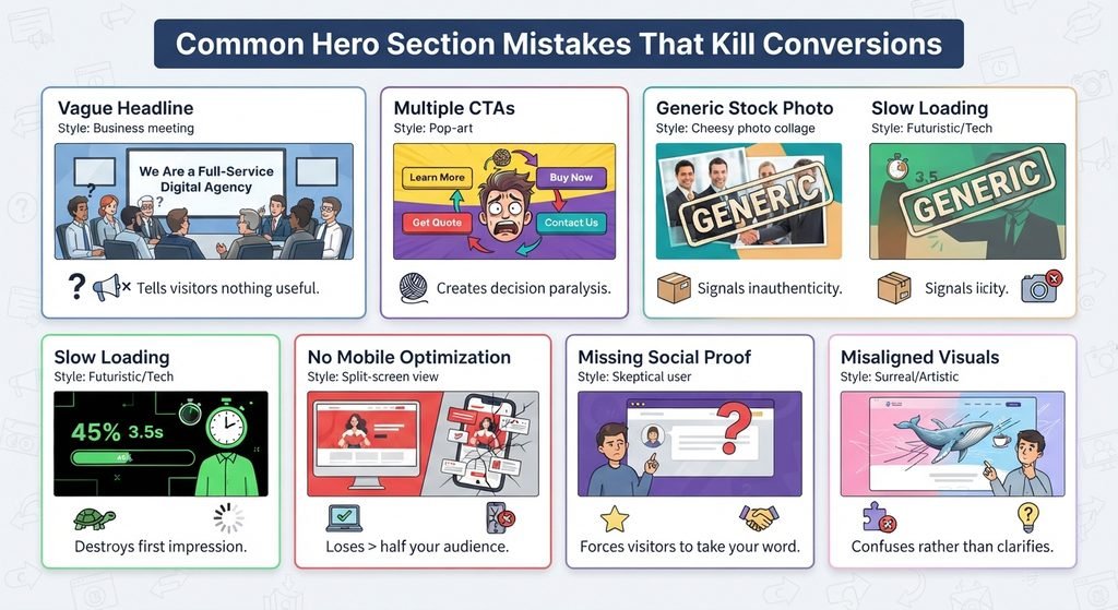
- Vague, self-focused headlines “We Are a Full-Service Digital Agency” tells visitors nothing useful.
- Multiple competing CTAs presenting four different buttons in the hero creates decision paralysis.
- Generic stock photography images that could belong to any company in any industry signal inauthenticity.
- Slow loading backgrounds an image or video that takes more than two seconds to load destroys your first impression before it even forms.
- No mobile optimization a hero that looks stunning on desktop but breaks on mobile loses more than half your audience immediately.
- Missing social proof launching into a pitch without any credibility signal forces visitors to take your word for everything.
- Misaligned visuals using abstract or decorative imagery that has no clear connection to your service or product confuses rather than clarifies.
How to Test and Improve Your Hero Section Over Time
Your first hero section design should not be your final one. High-performing businesses treat the hero section as an ongoing experiment. A/B testing different headlines, CTA copy, visual elements, and layouts provides real data on what resonates with your specific audience. Start with the highest-impact variable: the headline. Test two versions with the same audience over a statistically significant period and let the data decide. Then move on to the CTA, then the imagery. Do not change multiple elements at once, as you will not be able to attribute what drove the change in performance.
Pair your testing with behavioral data. Heatmaps, scroll depth data, and click maps will show you exactly how visitors interact with your hero section which elements they engage with and which they completely ignore. This kind of insight goes far beyond what A/B test numbers alone can tell you.
Conclusion: Design Your Hero Section With Intention
Your hero section is not a header image or a banner. It is the single most important conversion asset on your website. Every element the headline, subheadline, CTA, imagery, social proof, and layout works either for or against your business goals. There is no neutral. The businesses that win online are those that approach hero design with the same rigor they apply to their best sales conversations. They know their customer, they lead with outcome, they remove friction, and they test relentlessly. Follow the same principles and your hero section will do exactly what it is supposed to do: stop visitors in their tracks and pull them deeper into your world.
If you want to audit the rest of your site with the same level of detail, start with our complete website audit checklist with 50 critical items to review it will show you exactly where opportunities are being left on the table.
Frequently Asked Questions
1. Why is the hero section important for website conversions?
The hero section creates the visitor’s first impression and should quickly communicate what you offer, who you serve, why it matters, and what action to take next.
2. What should a high-converting hero section include?
A strong hero section should include an outcome-focused headline, supporting subheadline, clear primary CTA, relevant visual, and a subtle social proof element.
3. How should a hero section be optimized for mobile devices?
Use responsive typography, appropriately sized visuals, large tap-friendly CTA buttons, logical content stacking, and optimized media to ensure the hero remains clear and fast on smaller screens.
4. Should a hero section have more than one call to action?
A hero section should have one clear primary CTA to avoid decision fatigue. A secondary action can be included, but it should remain visually less prominent.
5. How can I improve my hero section’s conversion rate?
Test different headlines, CTA copy, visuals, and layouts using A/B testing, then combine the results with heatmaps and user behavior data to identify what performs best.