Your Homepage Has One Job Most Websites Fail at It
Your homepage is not a brochure. It is not a portfolio dump. It is not a place to list every service you offer in bullet point form. Your homepage has one job: to take a cold, skeptical, distracted first-time visitor and move them one step closer to becoming a lead or customer.
Most business websites fail at this. They open with vague taglines, bury their value proposition under a hero image, and leave visitors confused about what the company actually does within the first five seconds. The result? A high bounce rate, low engagement, and a site that costs more to maintain than it ever earns back.
This guide breaks down exactly how to design a homepage that converts from the structure above the fold to the final call to action at the bottom so every element works together to build trust and drive action.
Understand Who Your Homepage Is Talking To
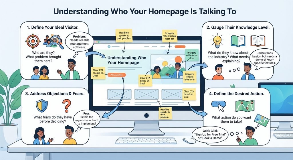
Before you touch a single design element, you need to get crystal clear on your audience. A homepage that tries to speak to everyone ends up resonating with no one. The most effective converting homepages are designed with a specific primary visitor in mind.
Ask yourself:
- Who is my ideal visitor, and what problem brought them to my site?
- What do they already know about my industry, and what do they need explained?
- What objections or fears do they have before making a decision?
- What action do I most want them to take after visiting my homepage?
Your answers should directly shape the copy, imagery, and layout you choose. When your homepage speaks directly to a visitor’s situation, they feel understood and people buy from those who understand them.
The Above-the-Fold Section: Your Most Critical Real Estate
The above-the-fold area everything visible before a user scrolls carries more weight than any other part of your homepage. Research consistently shows that visitors decide within seconds whether to stay or leave. What you put in that first viewport must do heavy lifting fast.
A high-converting above-the-fold section should include:
- A clear headline that states what you do and who you do it for
- A supporting subheadline that elaborates on the benefit or outcome
- A primary CTA that is specific, visible, and action-oriented
- Visual trust signals such as logos, ratings, or a strong hero image
- Navigation that does not overwhelm clean, minimal, and purposeful
If your headline reads something like “Welcome to Our Company” or “Innovative Solutions for Your Business,” you are already losing visitors. Your headline should answer the question: “What’s in it for me?” as fast as possible. For a deeper breakdown of what belongs above the fold and why each element matters, read The Complete Guide to Above-the-Fold Web Design: What to Include and Why.
Structure Your Homepage Like a Sales Conversation
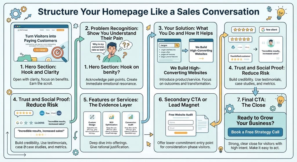
The best homepages follow a logical narrative flow one that mirrors how a skilled salesperson would talk to a prospect in real life. They do not open with a feature list. They open with empathy, establish credibility, present a solution, and then ask for the next step.
Here is a proven homepage structure that converts:
1. Hero Section Hook and Clarity
Open with your headline, subheadline, and primary CTA. This is where you earn the scroll. Keep it clean, specific, and benefit-driven.
2. Problem Recognition Show You Understand Their Pain
Before pitching your solution, acknowledge the problem your visitor is experiencing. This section should make your target customer feel seen. Two to three short sentences or a brief list of pain points is usually enough to create immediate emotional resonance.
3. Your Solution What You Do and How It Helps
Now introduce your service or product as the logical answer to that problem. Keep the focus on outcomes and transformation, not on features or processes. Instead of “We build custom websites,” say “We build websites that turn visitors into paying customers.”
4. Trust and Social Proof Reduce Risk
First-time visitors do not know you. They are skeptical by default. This section is where you earn credibility through testimonials, case studies, client logos, awards, or notable metrics. Social proof works because it borrows the trust that others have already placed in you. If you have not optimized this section yet, the guide on how to use social proof on your website to build trust and drive conversions is essential reading.
5. Features or Services The Evidence Layer
After you have established trust, you can go deeper into what you offer. Use icons, short descriptions, and benefit-led copy. Avoid jargon. Think of this section as giving visitors the rational justification for a decision they have already started to make emotionally.
6. Secondary CTA or Lead Magnet
Not every visitor is ready to buy the moment they land on your site. Offer a lower-commitment entry point a free audit, a downloadable guide, a consultation call. This nurtures visitors who are still in the consideration phase.
7. Final CTA The Close
End your homepage with a strong, clear call to action. Repeat your primary offer and make it easy to take the next step. Visitors who scroll to the bottom have strong intent do not waste them with a weak or confusing close.
Visual Design Principles That Drive Conversions
Layout, color, typography, and whitespace are not just aesthetic choices they are conversion tools. Every design decision either helps or hurts your ability to guide visitors toward taking action.
Use Visual Hierarchy to Guide the Eye
Your most important elements headline, CTA, key benefit should be the largest, boldest, and most prominently placed. Everything else should support them, not compete with them. Visitors should never have to search for what to do next.
Choose Colors Intentionally
Color triggers emotion and directs attention. Your CTA button color should contrast strongly with the surrounding design so it pops. Your brand colors should communicate the right personality trust, energy, calm, or authority for your audience and industry. Understanding how to use color psychology in web design to drive more conversions can give you a significant edge over competitors who treat color as decoration rather than a strategic tool.
Give Your Content Room to Breathe
Cluttered homepages feel overwhelming and untrustworthy. Generous white space signals professionalism and makes your content easier to process. Visitors absorb information better when it is presented with enough visual breathing room, which increases the likelihood they will read, engage, and convert.
Use Typography to Improve Readability
Font size, line spacing, and typeface selection directly affect whether visitors read your content or skip it. Tiny text, poor contrast, and decorative fonts that sacrifice legibility all work against you. Clear, readable typography keeps visitors engaged long enough to absorb your message and take action.
Speed, Mobile, and Technical Performance Matter Too
Even the most brilliantly designed homepage will fail to convert if it loads slowly or breaks on mobile devices. Page speed is one of the most underrated conversion factors every additional second of load time directly increases your bounce rate and costs you leads. If you want to understand the financial impact of slow load times, the post on page speed and conversions: why every second costs you money lays it out clearly.
Beyond speed, your homepage must perform flawlessly on smartphones. Mobile traffic now accounts for the majority of web visits across most industries. If your homepage design does not adapt cleanly to smaller screens with tappable buttons, readable text, and properly stacked layouts you are losing a significant portion of your potential leads before they ever see your offer.
Common Homepage Design Mistakes That Kill Conversions
Knowing what to avoid is just as important as knowing what to include. These are the most common homepage mistakes that cost businesses leads every single day:
- Vague or generic headlines that do not communicate a specific value proposition
- Too many competing CTAs that create decision paralysis instead of directing action
- Auto-playing videos or animations that slow down load time and distract from the message
- No visible trust signals above the fold, leaving first-time visitors with no reason to stay
- Copy focused on the business rather than the visitor’s problem, needs, and desired outcome
- Walls of text that overwhelm visitors instead of guiding them through a clear narrative
- No clear next step for visitors who are not yet ready to buy missing the opportunity to capture leads at every stage of the funnel
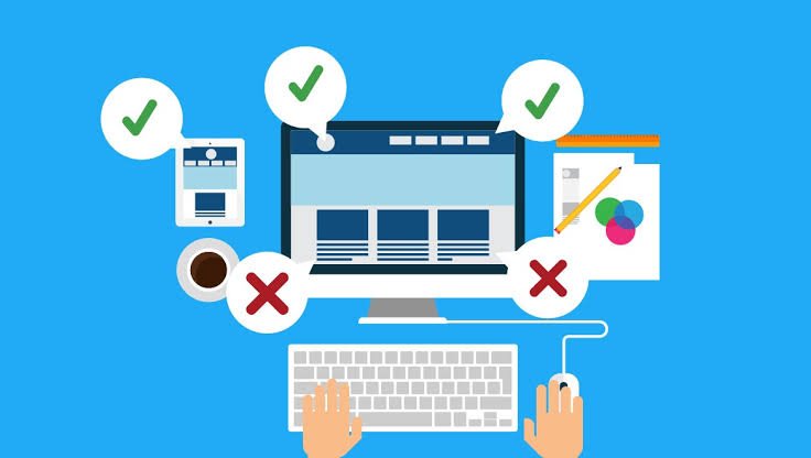
Test, Measure, and Continuously Improve
Designing a high-converting homepage is not a one-time event it is an ongoing process of testing and refinement. Even small changes to a headline, button color, or section order can produce measurable differences in conversion rates. Use A/B testing tools to experiment with different versions of your key elements, and use heatmaps and scroll tracking to understand how real visitors actually interact with your page. Understanding how users behave on your site through behavior data gives you an evidence-based foundation for every design decision you make.
Set a benchmark for your current homepage conversion rate, then track how each change affects it. Consistent, data-driven iteration is how top-performing websites maintain their edge over time.
Conclusion: Design Your Homepage as a Conversion Machine
Your homepage is often the first and most critical touchpoint between your business and a potential customer. When it is designed with intention with a clear audience in mind, a logical narrative structure, trust-building elements, and strong visual hierarchy it becomes one of the most powerful lead generation assets your business owns.
Stop treating your homepage as a digital business card. Start treating it as a conversion machine that works around the clock to turn strangers into prospects and prospects into paying clients. Every section, every sentence, and every design choice should serve that single goal.
If you are ready to build or redesign a homepage that genuinely converts, the work begins with understanding your audience, getting your message right, and executing a design that makes taking the next step feel natural, obvious, and easy.
Frequently Asked Questions
1. What makes a homepage effective for conversions?
A high-converting homepage clearly communicates who you serve, the problem you solve, the value you provide, and the next action visitors should take.2. What should be included above the fold on a homepage?
The above-the-fold section should include a clear value-driven headline, supporting subheadline, primary CTA, relevant visual or trust signal, and simple navigation.3. How should a homepage be structured to guide visitors toward conversion?
A strong homepage typically flows from the hero section to problem recognition, solution, social proof, services or features, a secondary offer, and a final CTA.
4.How can website design elements improve homepage conversions?
Visual hierarchy, intentional colors, readable typography, and strategic white space help visitors understand the message quickly and guide their attention toward important actions.
5. How can I measure and improve my homepage conversion rate?
Track your current conversion rate, test elements such as headlines and CTAs with A/B testing, and use heatmaps and scroll tracking to understand how visitors interact with the page.